Create a system that is the main core in the project. The type setting, colors, the imagery should be consistent in the annual report. Costco Wholesale is the company that I chose. The most challenging thing about doing the Costco Wholesale annual report was finding imagery. Because images of Costco are usually complicated and literal, designer had to search for images that are more abstract and interesting to present the work. Based on Costco’s existing logo, designer kept the blue and red as dominant colors. Therefore, people can precisely recognize this as an annual report for Costco.
Castco Annual Report Re-design
Course: Type Systems
Course: Type Systems
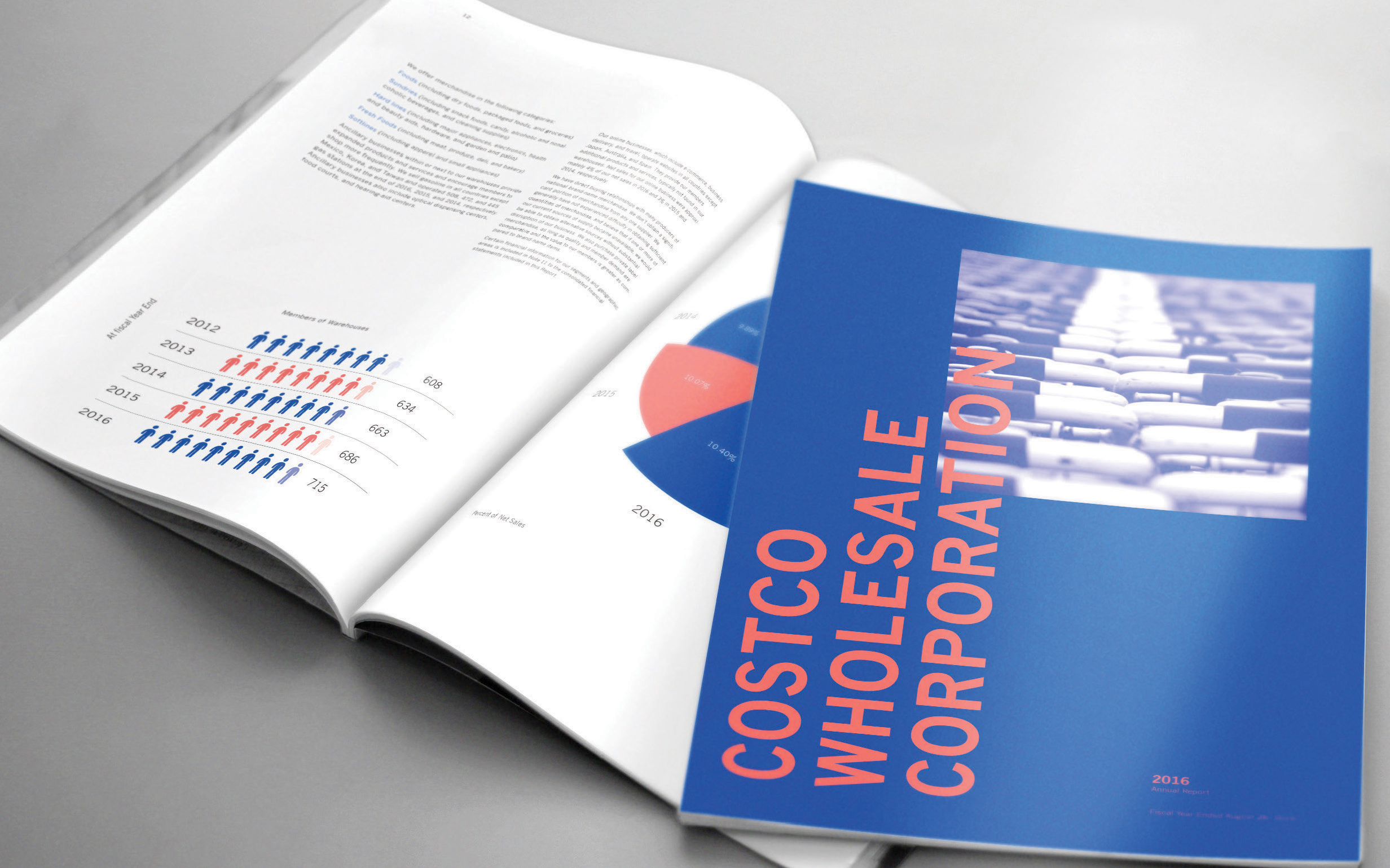
在這個項目裡,設計一套系統是主要的核心。在年度報告裡,字型的配置與顏色以及圖像應該被一致的使用。Costco Wholesale的年度報告中,最具挑戰性的是圖像的搜索,因為Costco的形象多半較為複雜且直覺,設計師必須使用一些相較抽象且有趣的圖像,來呈現這項作品。基於Costco圖標的顏色,而保留了藍色與紅色作為主導的顏色;因此人們可以精確的辨認這是Costco的年度報告。