Taking the mathematical symbol "∞" as the design idea, the main visual design for the 63rd anniversary celebration of Shih Chien University was constructed. The overall color is set in 2021 as the main color of the popular colors "gray" and "yellow". The simplicity and neatness of a racing track not only symbolizes the profound foundation of Shih Chien University’s founding of a school, but also symbolizes the connotation of sustainable and endless development of the school.
The raised "V" line in the upper right corner of the number 3 symbol shape, in addition to increasing the viewing level of the symbol, also implies the power and vitality of the continuous positive development of school affairs.
The raised "V" line in the upper right corner of the number 3 symbol shape, in addition to increasing the viewing level of the symbol, also implies the power and vitality of the continuous positive development of school affairs.
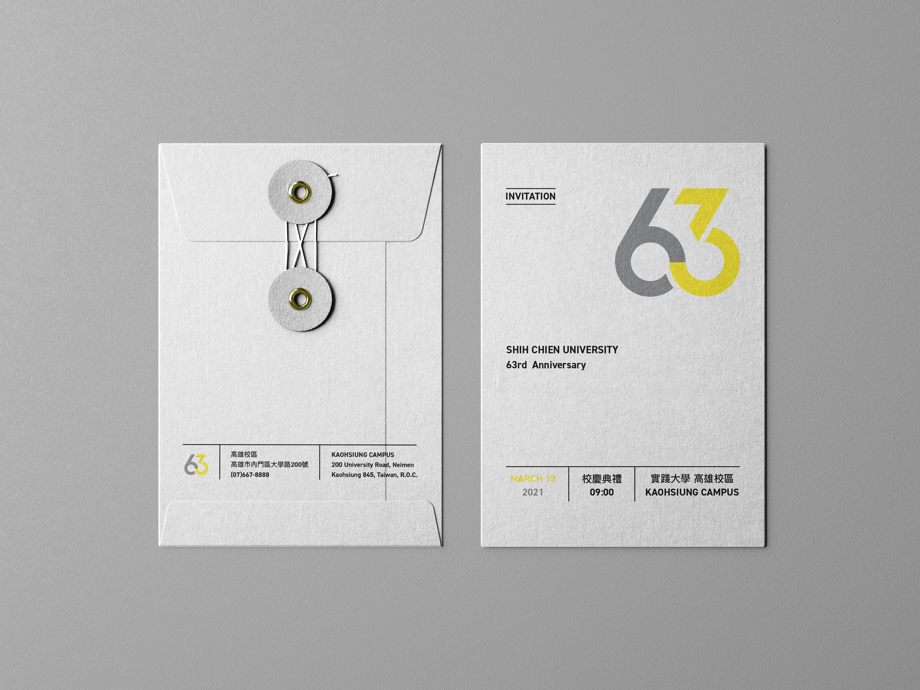
Shih Chien University Kaohsiung Campus
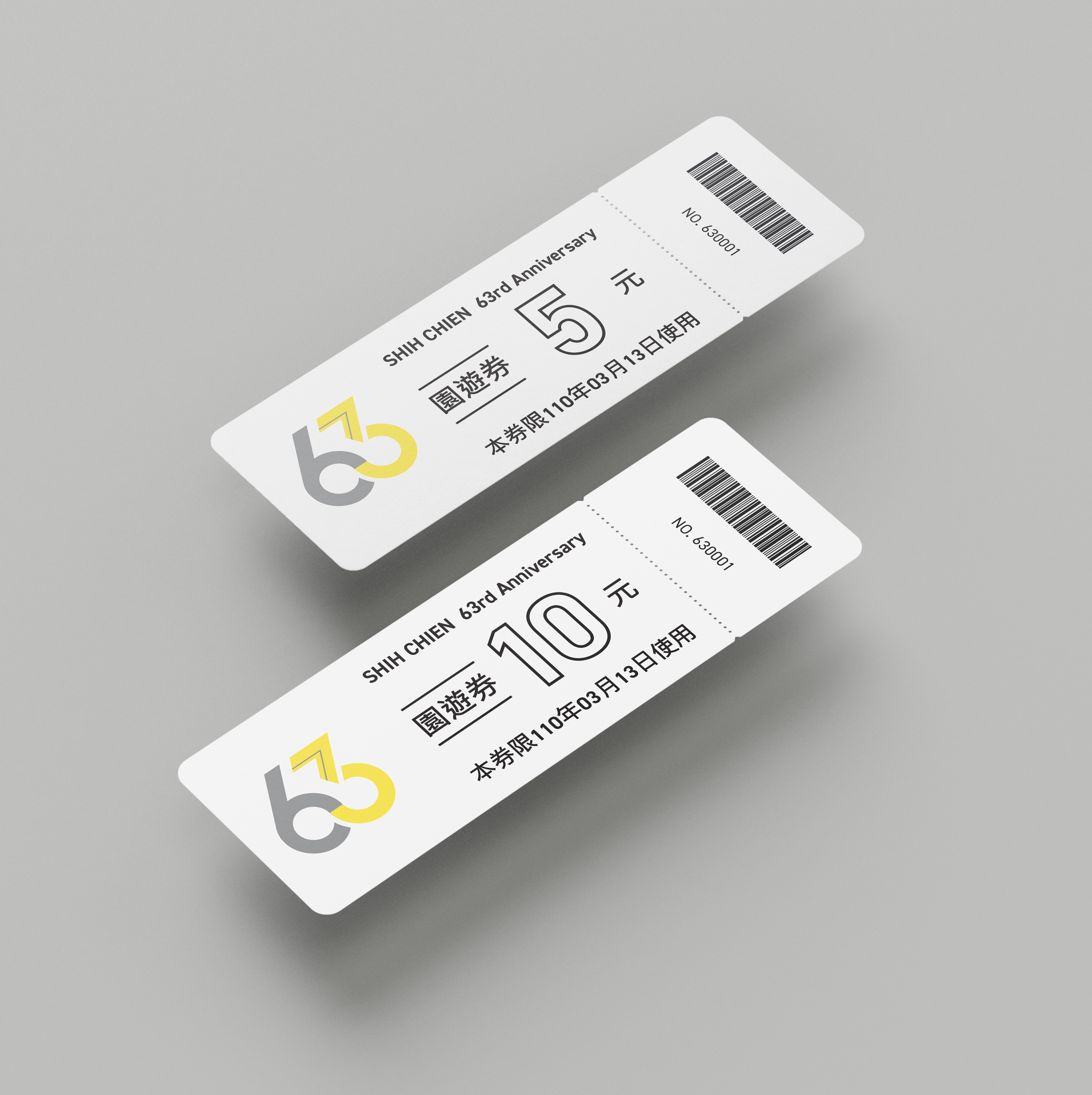
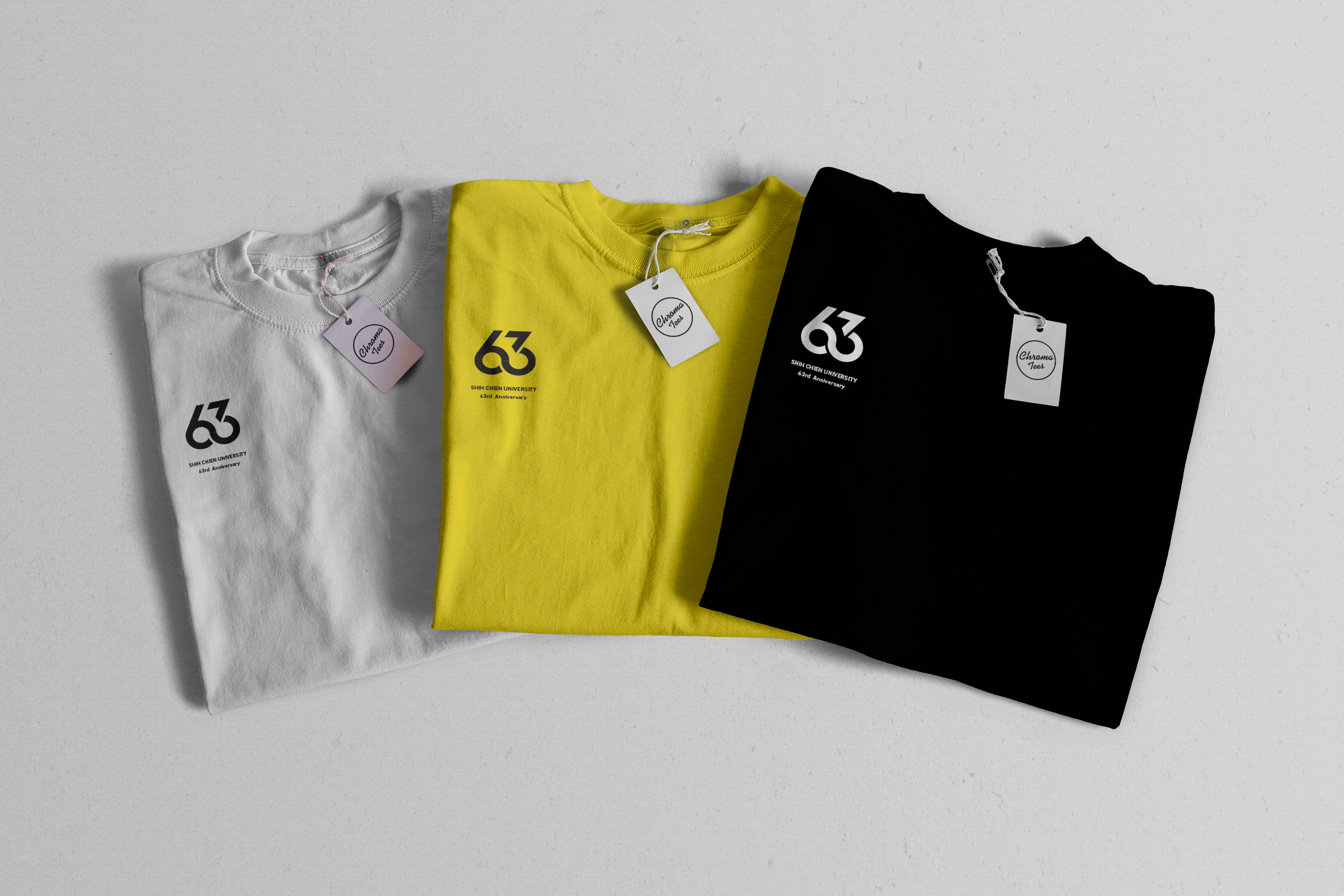
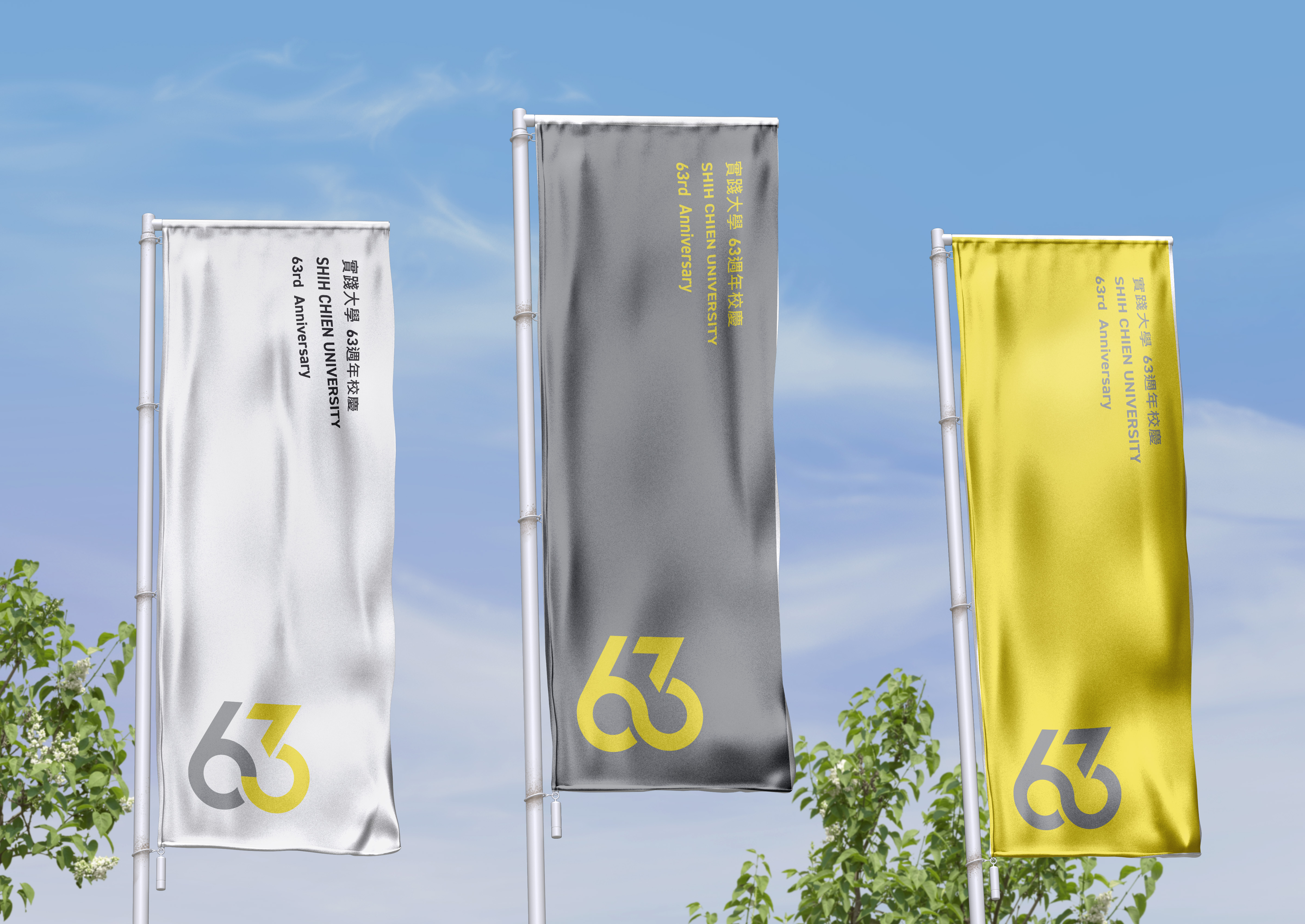
63rd Anniversary
63rd Anniversary


以數學符號無限
「∞」 為設計發想,構築了實踐大學63週年校慶主視覺設計。整體色彩以2021年的年度流行色,灰與黃為主調,灰色表現沈穩內斂的校風,黃色傳達了校務整發展的創意與活力。
「∞」 符號造形如競速跑道般簡潔俐落,除了象徵實踐大學創校一甲子有三的深刻底蘊,更象徵了學校發展的永續與生生不息的內涵。數字3符號造型右上角揚起的 「V」 線條,除了增加符號的觀看層次外,也寓意了校務持續正向發展前進的動力與活力。
「∞」 符號造形如競速跑道般簡潔俐落,除了象徵實踐大學創校一甲子有三的深刻底蘊,更象徵了學校發展的永續與生生不息的內涵。數字3符號造型右上角揚起的 「V」 線條,除了增加符號的觀看層次外,也寓意了校務持續正向發展前進的動力與活力。